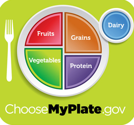
 The FDA recently revised its ‘food pyramid’ into an easier-to-understand plate graphic. This is a good first step. We could debate the veracity of this image, especially since “protein” isn’t a food, and for Americans like me it’s coming from vegetables, primarily legumes. We could debate whether dairy even needs to be in this image, as many Americans (including myself) skip dairy with no ill health effects (in fact, the opposite!). Instead, though, let’s look at whether this image will have any effect. It’s widely known amongst public health scholars that informing the public is not the most effective way to create healthy changes. Scaring the public has about the same results (this seems to be a favorite tactic in America, despite its lack of efficacy). I would argue that inspiration, coupled with policy changes, are the best medicine. And this is where the plate graphic falls short — can we really expect a snazzy image to make much of a difference in vegetable consumption?
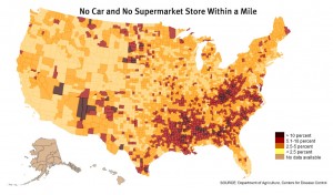
Even if a member of the public wants to follow the recommendations in this graphic, can she? If she lives in an affluent neighborhood, shops at Whole Foods, then yes. What about those folks who don’t shop at Whole Foods, who live in neighborhoods of lower socioeconomic status, neighborhoods that have a much higher concentration of fast food chains than grocery stores? And even if she gets to a grocery store, if she’s shopping on a budget, what can she afford?
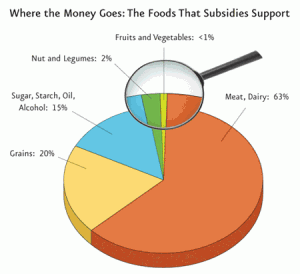
 The graphic at left is from the Physicians Committee for Responsible Medicine, and it shows the breakdown of food subsidies in the USA. Herein lies the problem. For those on a budget, are fruits and vegetables affordable? Less than 1% of food subsidies in the United States are going to fruits and vegetables. Nuts and legumes, my main source of protein, are accounting for 4% of subsidies.
We live in a highly socialist country, it’s just that we have socialism for corporations, not for citizens — socialism for Wall Street and Agribusiness. So the most affordable items are the ones that end up on fast food menus: meats and sweets. Numerous studies have found a positive correlation between obesity and the clustering of fast food, convenience stores, lack of grocery stores in areas of lower socioeconomic status. One study found that African Americans had to travel 1.2 miles further, on average, than Anglo Americans in order to reach a grocery store, while other studies have found fast food clustering in black spaces to be in the range of two-to-three restaurants per square mile (nearly double that of predominantly white neighborhoods within the same city).
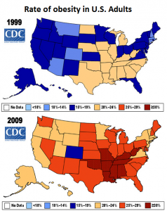
US obesity is the highest it’s ever been, while the USDA now shows US household food security at the lowest levels since it began tracking this data. “Rates of food insecurity were substantially higher than the national average among households with incomes near or below the Federal poverty line, among households with children headed by single parents, and among Black and Hispanic households.”  The actual data: 11% of whites were food insecure, 25% of blacks, 27% of hispanics, and 37% of single-female households (with one or more children); nearly half of the households at the federal poverty line were ‘food insecure’. Keep in mind that the food insecurity data has to do mostly with hunger, not with nutrition, so the situation is actually much, much worse** than the USDA is letting on. Of the 18 questions in the food security survey (completed by 46,000 households), only 3 dealt in any way with nutrition — two asked about “balanced meals,” and one about “low-cost food”.
 The fundamental problem is inequality. Inequality leads to certain folks having less physical access to grocery stores. Inequality leads to these same folks being more likely to avail themselves of fast food and convenience stores for calories. Socialism for Agribusiness and the intentional menu decisions of fast food conglomerates make it nearly impossible to eat well inside a fast food restaurant* or even a grocery store, unless you happen to have a degree in biochemistry and a lot of free time. This inequality leads to a high cost for marginalized folks in the United States — in the case of food this cost can come upfront in the extra effort it takes to get to a grocery store and dollars and knowledge required to support a balanced diet, or in the backend costs associated with worse health outcomes. Whatever and wherever the costs, they won’t be fixed by an easier to read nutritional diagram; it’s a good first step, but until we talk about policy changes, we’re really ignoring the problem.
I wanted to make a quick addition here. Since it’s been nearly a month since I originally posted, I figured it’s best to just add this at the end. I recently came across a great article on tomatoes. The article addresses why store-bought tomatoes are so flavorless, and then delves into the structural violence and even slavery surrounding the migrant workers who pick these fruits. On the former topic, there was a vegan restaurant on University Way in Seattle, called Araya’s, and they used to serve rice with the most amazingly flavorful cherry tomatoes in it. These things would burst in my mouth. They eventually moved a few blocks away and discontinued the dish. In the years since I have bought cherry tomatoes at the store, trying to recreate the dish myself, but it always ends up tasting, well, very bland. I assumed I just am terrible at cooking, but now it seems I may have my answer — agribusiness tomatoes can’t hold a candle to home grown and farmer’s market fare.
Update number two involves a recent report, F as in FAT, 2011, that details the multi-decade CDC data I mentioned previously. When I wrote about this before [the F as in FAT report came out] I wondered aloud whether Colorado is doing something funny. CO is the least obese state, and in fact if you look at obesity on a county-by-county level and study the CO border, just a few miles away in KS and NE things seem to be much worse. So what gives in Colorado? The F as in FAT report details each individual state, and this gives us some clues as to the etiology of CO’s adiposity.
Update number three involves a new study showing a strong correlation between meet and diabetes. You may have heard before about the link between tuna and mercury. Mercury bioaccumulates in tuna. The answer I’ve often heard is to eat salmon or other non-mercury-accumulating fish instead. Except salmon easily accumulate PCBs and other persistent organic pollutants. POPs also accumulate in other forms of “meat”. The result is that those who eat meat are exposed, and these POPs bioaccumulate within them. In the study linked above, a group of 725 Swedes was tracked for five years, and during that period 36 of them developed diabetes — those same 36 were the ones with the highest levels of POPs. Meanwhile, Philadelphia is closing 26 school kitchens in favor of trucked-in packaged food, in order to save money; cost outweighs concern for the childrens’ health, it would seem. Also, an interesting blog of a teacher who ate “school cafeteria lunch” every day for a year, in solidarity with her students.
*Seeing the handwriting on the wall, corporations like McDonald’s have been working to offer ‘health conscious’ menu options. These options are not cheap, when compared to the “dollar menu”, and most of the time they aren’t health conscious at all. The oatmeal McDonald’s just began offering contains more sugar than a Snickers bar, calories equivalent to a cheeseburger, and costs $2.40 (for this same amount you could purchase two double cheeseburgers and have money left over, or you could make many times as much oatmeal by simply buying it in a store and adding milk or water, since the raw cost of this oatmeal is literally cents). Even fast food from supposedly healthier outlets can be deceivingly artificial. Grist examines a ‘typical’ daily meal of “a bowl of cereal with low-fat milk, have yogurt for a snack, and a Subway sandwich for lunch.”
- One serving of Kellogg’s Fiber Plus Antioxidants Berry Yogurt Crunch contains more than 13 different additives, preservatives, and food dyes, including Red 40 and Blue 1, which are known to cause allergic reactions in some people and mutations leading to cancer in lab animals. It also contains BHT, monoglycerides, and cellulose gum. In addition, conventional milk often contains residues of artificial bovine growth hormones, known endocrine disruptors as well as antibiotics used in industrial milk production.
- Dannon Light & Fit Peach yogurt contains more than 11 different additives including Red 40, aspartame, potassium sorbate, sucralose, and acesulfame potassium.
- A Subway sandwich of turkey and cheese on nine-grain bread with fat-free honey mustard, peppers, and pickles contains more than 40 different additives, preservatives, and dyes. The pickles and peppers have Yellow 5 and polysorbate 80, the bread has 10 different additives including dough conditioners, DATEM, and sodium stearoyl lactylate, and the turkey contains 10 additives as well.
**From a nutritional standpoint. From a hunger standpoint, obviously it could be a lot worse.