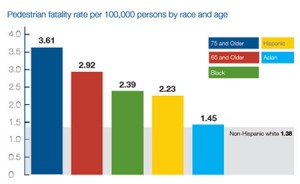
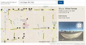
 There’s a really fascinating interactive gmaps-overlay for pedestrian deaths for 2000-2009 in the US, showing markers for each of the 47,700 pedestrian deaths (full PDF report here). Each marker contains intersection info, as well as date of fatality, and age, ethnicity, and gender of the victim. I like that the page refers to these roads as “dangerous by design.” The authors clearly see the structural violence at work here — we favor vehicles in this country, to an extreme, and pedestrians (disproportionately the poor, persons of color, and the elderly) pay the price. They point out that pedestrians comprise 12% of traffic deaths but only 1.5% of federal funds to retrofit roads are allocated to pedestrian safety issues.
In the image I posted here, you can clearly see how deaths cluster along certain particularly dangerous roads. Las Vegas (pictured) falls into the top ten most deadly cities in the US, with respect to pedestrian deaths, and it’s hard to choose a road in Vegas that isn’t a deadly one. If you’ve ever spent much  time there, you’d know to expect the bulk of the deaths in central and northern Vegas, which are the poorer and less white parts of town. The west side of town, Summerlin, is marked by doublewide sidewalks and ridiculously green public landscaping. In central Vegas I found there was a pedestrian death on the map that took place less than a block from my house in 2004, and I wasn’t even aware of it. This is the invisibility of structural violence. I don’t think cost savings should be the selling point, so to speak, for reducing pedestrian fatalities, but the authors point out the between 2000 and 2009 pedestrian deaths cost Nevada $2BN, and my home state of WA $3BN — CA tops the list at $30BN in pedestrian death costs in this nine year period. This cost data is based on the National Safety Council estimates of $4.3M/person costs (see the full report for more details). There are also, of course, the costs beyond just money. Human life should not come with a price tag.
Meanwhile, I’ve been poking around in some of the vaccination data that WA makes publicly available. Up until May of this year, if you didn’t want to vaccinate your child, all you’d need to do was sign an exemption form. Typically one might expect this to be for religious reasons, but analyzing the data shows that about 9 of 10 exemptions in WA are granted for “personal” rather than “religious” or “medical” reasons. Places in Washington, most notably Vashon Island, often get a bad wrap for having very low vaccination prevalence, due usually to parental concerns about the safety of vaccines. I’ve written about measles and vaccines before, but I’ll just summarize by saying: I can completely understand parents’ concerns, because there is a lot of conflicting info (celebrities, peer-reviewed journals, Internet forums), but vaccines have been consistently proven safe. I’ve also written about being in Nigeria and seeing children severely sickened or dying of complications from measles (a disease that no child should die from: the vaccine is safe, effective, and costs a mere twenty-six cents).
As of July of this year parents who want to exempt their children from required vaccinations for personal reasons will need to not just sign an exemption form at the school enrollment, but rather present a form from a healthcare provider. This extra step is meant to ensure parents have consulted someone who does have accurate information and can help them make a decision based on science and their own values, rather than hype, conspiracy theories, or Internet paranoia.
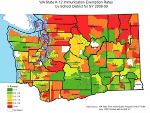
 The data I mentioned above is actually somewhat terse. There are three categories of under-vaccination: exempt, conditional, and non-compliant. Conditional presumably means partially vaccinated. Non-compliant may mean unvaccinated, or it may simply mean the documentation is not there. Exempt means what you think it means. So the exemption map I posted isn’t telling the whole story. Paradoxically, the reported coverage is actually higher than I would expect, suggesting that some (in fact: many) exempt children are known to be vaccinated. King Count, for instance, amongst 6th graders, has a 5.6% exempt rate, 1.8% conditional, and 14.7% non-compliant — yet the measles vaccination rate is 96.4%. The implication here, I think, is that almost all of the conditional and non-compliant 6th graders are known to be vaccinated, and even a portion (about 20%?) of the exempt kids are also known to be vaccinated. This is the only conclusion that allows me to reconcile the data. Amongst 6th graders, only 2 counties dip below the 90% mark for measles vaccination prevalence. This is good. Pertussis dips into the sub-90% range in more than 29 districts (leaving only 10 that are 90% or above!).
Pertussis can be just as deadly as measles (in the US this means about one in one-thousand will die), however, and generally a 90% prevalence of vaccination is required for “herd immunity.” Herd immunity simply means that a large enough proportion are vaccination that if any one individual becomes ill the sickness will not have susceptible targets it can use to spread. More children in California died of whooping cough last year than did since 1950. Ninety percent of these deaths were Hispanic children.